The story behind the International Team's inspirational shield
6 Min Read
MELBOURNE, Australia – The cynic might say the new black-and-gold shield logo representing the International Team at last week’s Presidents Cup is simply a piece of art. Something useful for marketing purposes. Something to stick on hats and shirts, on caddie bibs and the bags they’re carrying. An easily identifying symbol for the home team at Royal Melbourne, just like the American flag is for their opponents.
It doesn’t have any special powers.
Then again …
For the first time since 2003, they entered Sunday Singles with the lead and a great opportunity to end the 21-year drought since their first (and only) Presidents Cup victory.
Although it didn’t happen, with the U.S. rallying to win 16-14, the Internationals will one day get over the disappointment and realize the foundation was laid at Royal Melbourne for a new era with a bright future.
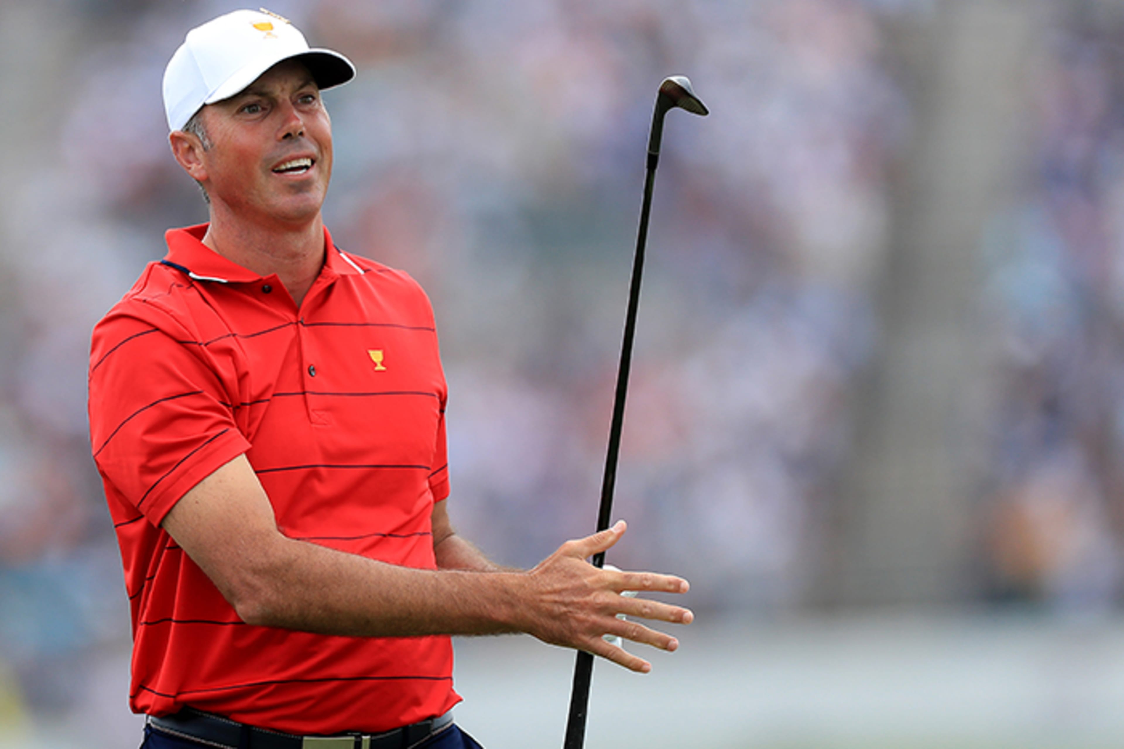
Sure, they played great golf. But there was also been plenty of discussion last week about that brawny new logo commissioned by Captain Ernie Els. To a man, the Internationals say it’s more than simply a well-designed graphic. They insist it’s given the International Team a fresh identity, a rallying point. Els has used it for motivation – and his players responded.
“It brings us all under one logo, one flag,” said Canadian Adam Hadwin. “Brings us unity – something we may not have had in previous years.”
“We have something to play for,” added Australian Marc Leishman. “We have a flag to play under. We want to do that proud.”
The Internationals have had a handful of flag-type logos in previous Presidents Cups. Just two years ago, it was a light-blue flag with five gold stars, each start representing one of the five continents supplying potential players to the team.
The look was a familiar one.
“It felt very much like the European Ryder Cup logo,” said Els’ manager Rob Goulet. “He didn’t feel like it was powerful enough for us to take forward.”
Meanwhile, the light blue was not a particularly favorite color of Els. So when he took over for Nick Price soon after the 2017 Presidents Cup, one of the first things Els wanted to do was create a new look with completely different colors.
But he wanted it to be more than just a logo. With the Internationals suffering an embarrassing rout at Liberty National, Els needed something inspirational, something his players could point to with pride, something that would represent both their team and also their individual countries and get them re-engaged.
As with all the International Team captains before him, Els had a unique challenge not faced by the American counterparts. With so many countries and regions on his team, he must balance the one-team concept while still allowing players to represent their homelands.
Els also wanted to put his own individual stamp on the new logo. He has several friends that are in Special Forces and Navy Seals, and in speaking with them, Els learned the value of the shield patches.
“They use them as key motivators,” Goulet said. “Ernie took a little piece out of that.”
Indeed, Els drew comparisons to the military when discussing the importance of a new symbol.
“When it gets down to the heat of the battle, you want to really pull from something,” Els said. “Something that’s official for our team. Something we stand for. … Guys are playing for one another. Our identity is our logo.”
In addition, Els was adamant that a player’s flag from his homeland also be added when appropriate, such as on individual bags and caddie bibs.
Certainly it was a lot to incorporate, and new colors were also needed – bold colors, not weak ones. Colors that stood out.
Searching for an artist, Goulet reached out to someone he knew -- Jeff Costa, who has experience working with sports teams and is drawn to the branding of international soccer teams, many of which use shields as their logos.
As they discussed the design, Els and Costa found inspiration from three elements:
• Flags that symbolize both golf and patriotism.
• Shield to represent strength, security and defense.
• Celtic knot representing unity, faith and loyalty.
So Costa went to work to link all those things into a clean, bold look, while also incorporating a landing spot for a player’s home flag.
Roughly 40 iterations of the logo were evaluated. The first few involved stars, but those were eventually dropped. The process was a constant back and forth. The colors were evaluated – black and gold became the favorite. No surprise that many sports teams, as well as military patches, use those colors.
Els, as usual, was meticulous. The final product had to be perfect – and he eventually saw the design that touched him the most. It had taken nearly six months.
During the week of the 2018 U.S. Open, Els held a meeting at Sebonack Golf Club with more than 40 potential players vying to make the International Team. He unveiled the logo. More importantly, he told the story of what he was trying to accomplish and why this shield was loaded with meaning.
It was an immediate hit.
“Everybody was fired up,” Goulet recalled.
As Royal Melbourne got closer, players spoke more and more about playing for the shield. They were definitely buying in.
“Obviously we needed something we could start to embrace,” said Adam Scott, the most veteran player on the International Team. “We needed something that came from one of us, and Ernie is as good as anyone for that. He’s been involved with the Cup since the very first one. …
“Hopefully, this is the start of a new culture for the International Team.”
“The shield is a great logo,” said assistant captain Mike Weir. “It brings so many things together. It brings all these countries together. I think before in the past, we were representing our countries but maybe there was a lack of identity. I feel like that’s coming together this year.”
“This is now our identity, our logo,” added Els’ fellow South African, Louis Oosthuizen. “This is the team we’re playing for.”
Despite all the elements used in the design of the shield, and all the things that inspired it, the full story remains a secret.
There are aspects of the logo that Els wants to keep inside the team room. Things only he, his staff and his players know. It’s another way of creating a bond within his team.
“There’s a little bit of mystique there,” Goulet said. “It’s a team thing and Ernie wants to keep it to the team. But it’s powerful.”
Perhaps that bond made an impact at Royal Melbourne. Or simply credit the man who made it happen.
“It’s not just a logo; it’s also about Ernie,” Goulet said. “He’s a wonderful motivator, an amazing captain. Everybody respects Ernie Els.”